
Red & black kitchen
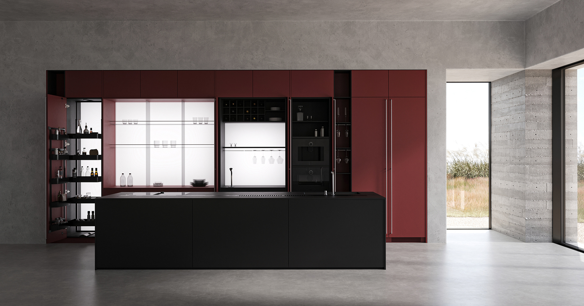
This project is a kitchen catalog visualization built around the contrast between red and black.
The overall structure and composition were kept simple and clear
to ensure that the product’s original color and material textures were accurately conveyed.
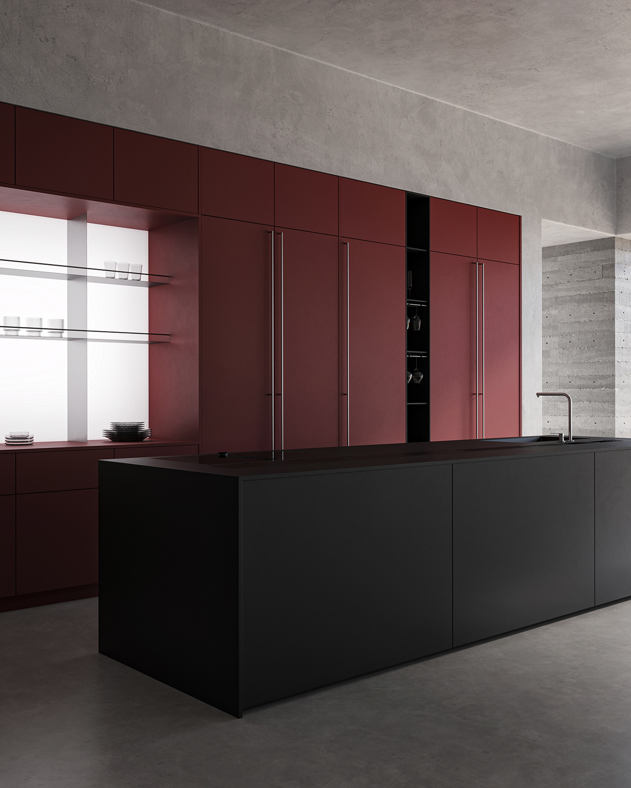
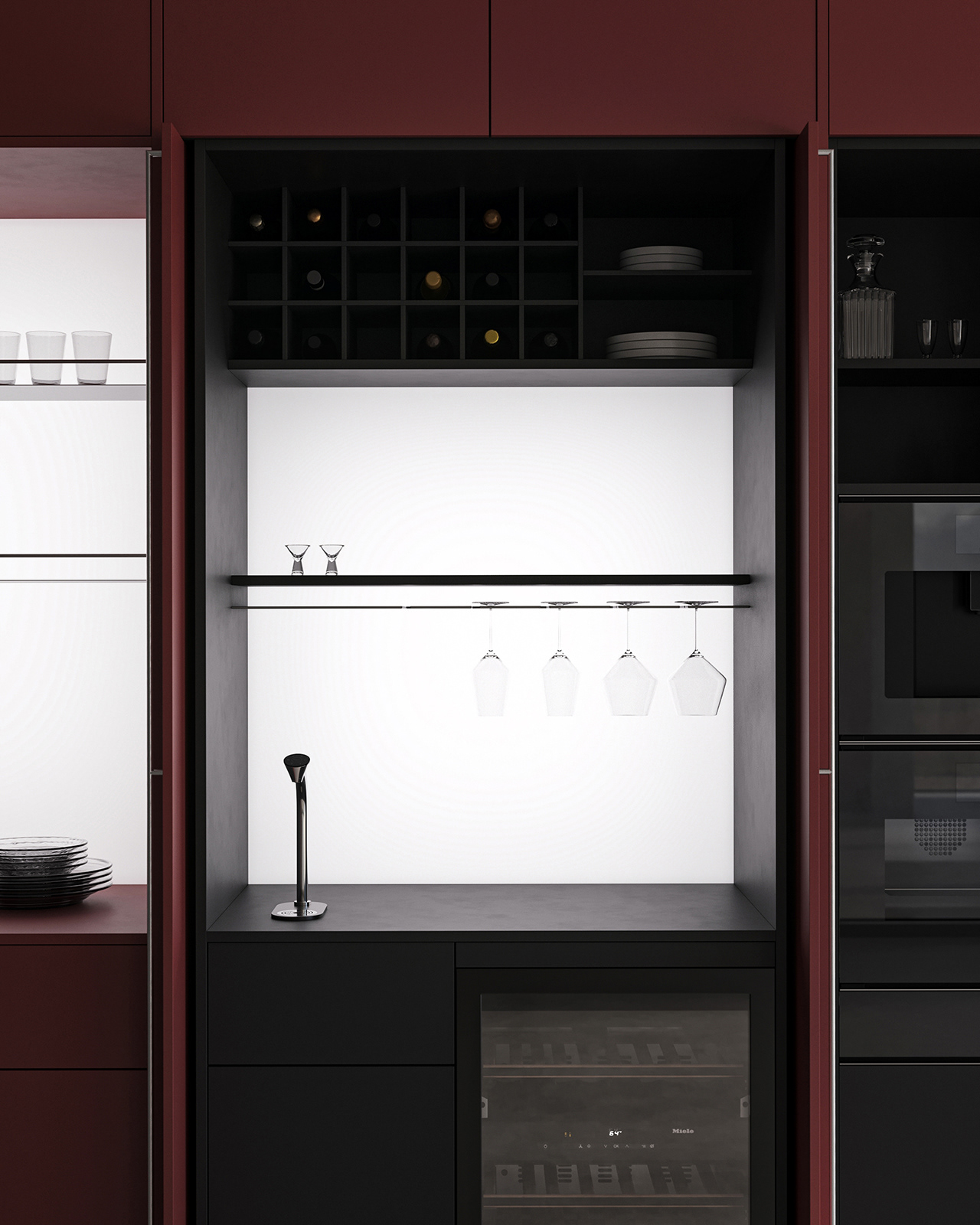
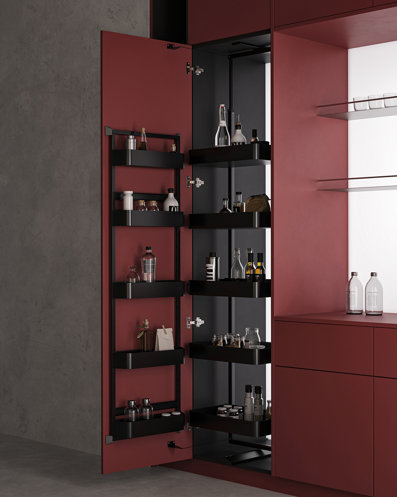
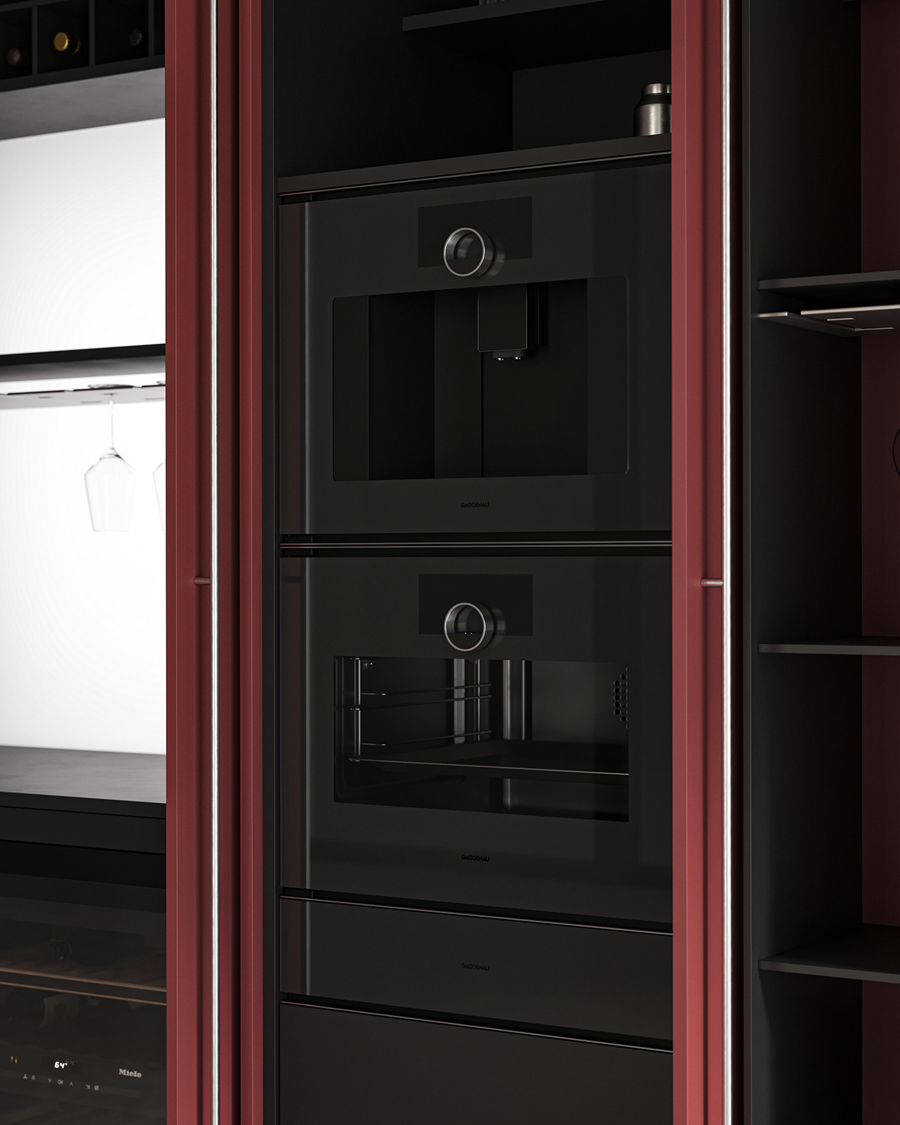
The red cabinetry was positioned as the visual focal point,
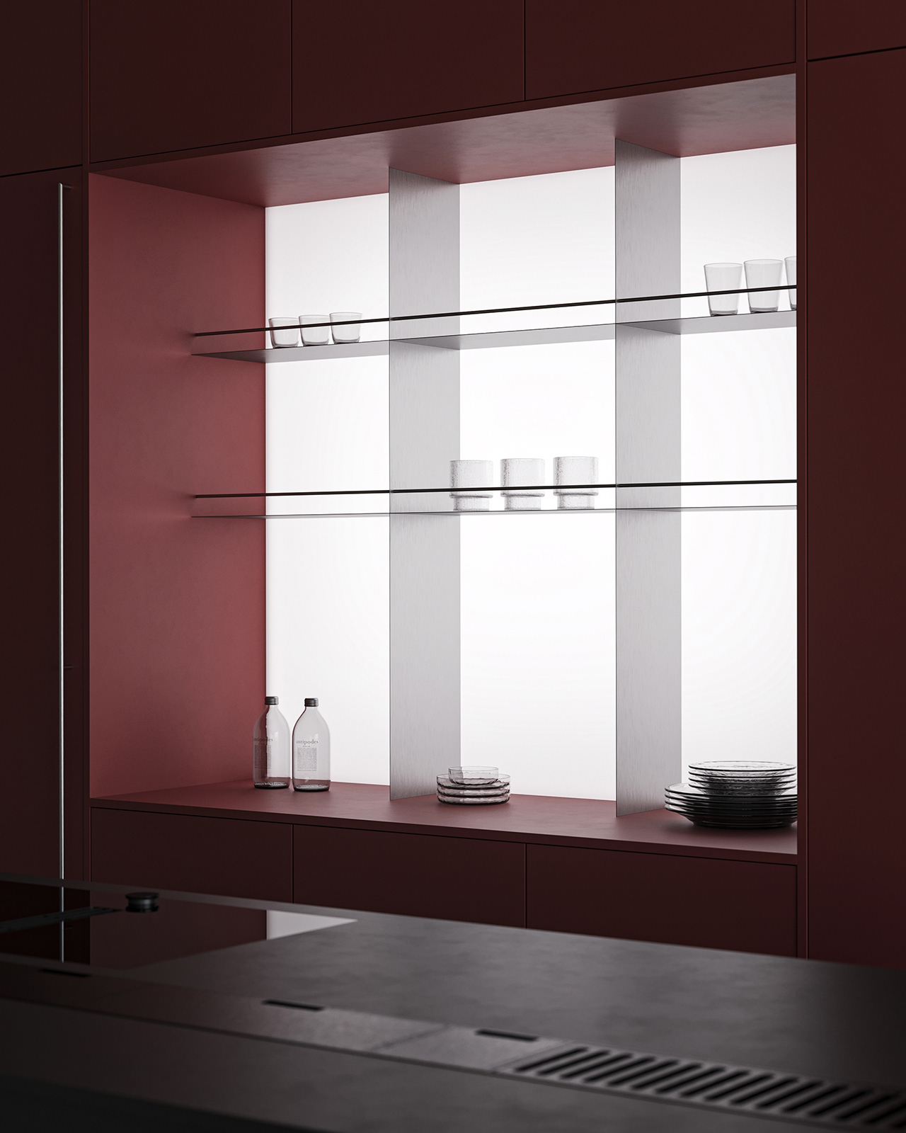
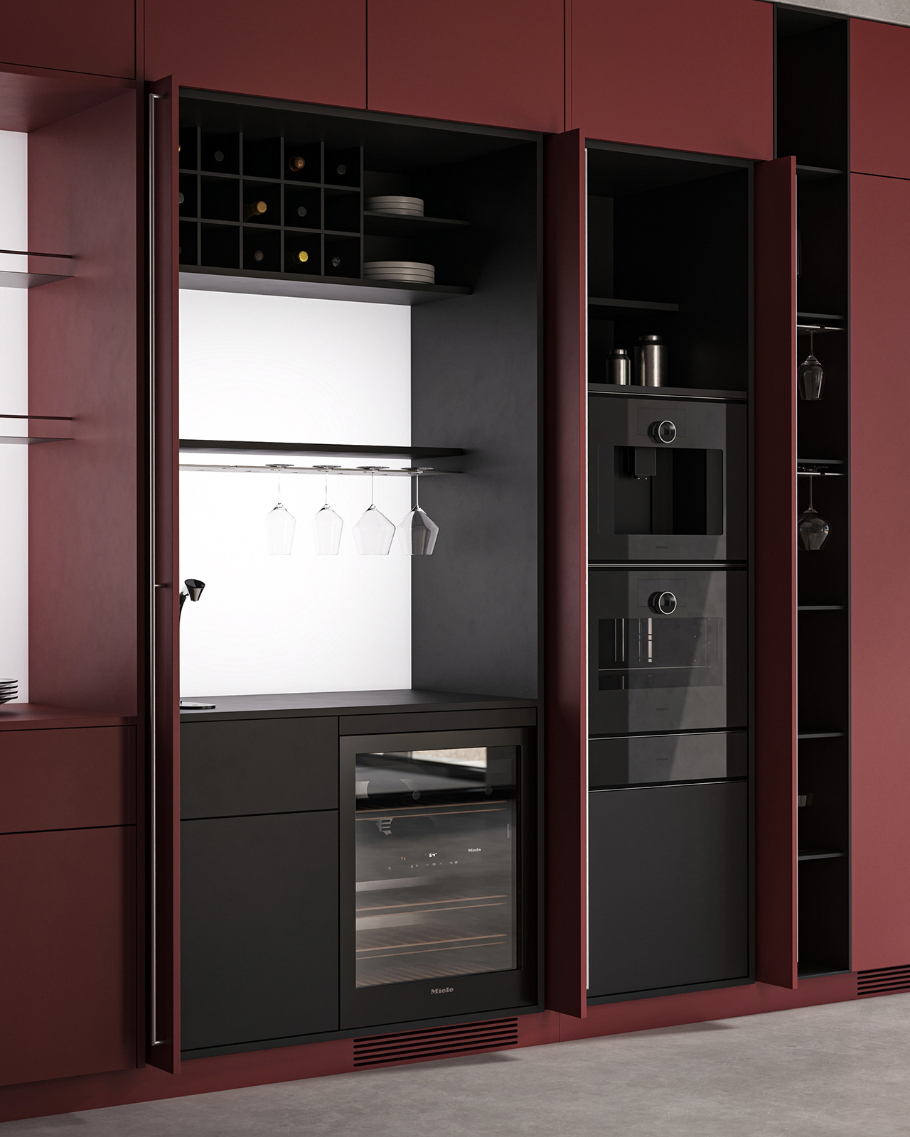
while the indirect lighting on the back panel and the systematic storage layout
helped create the image of a well-organized kitchen system.
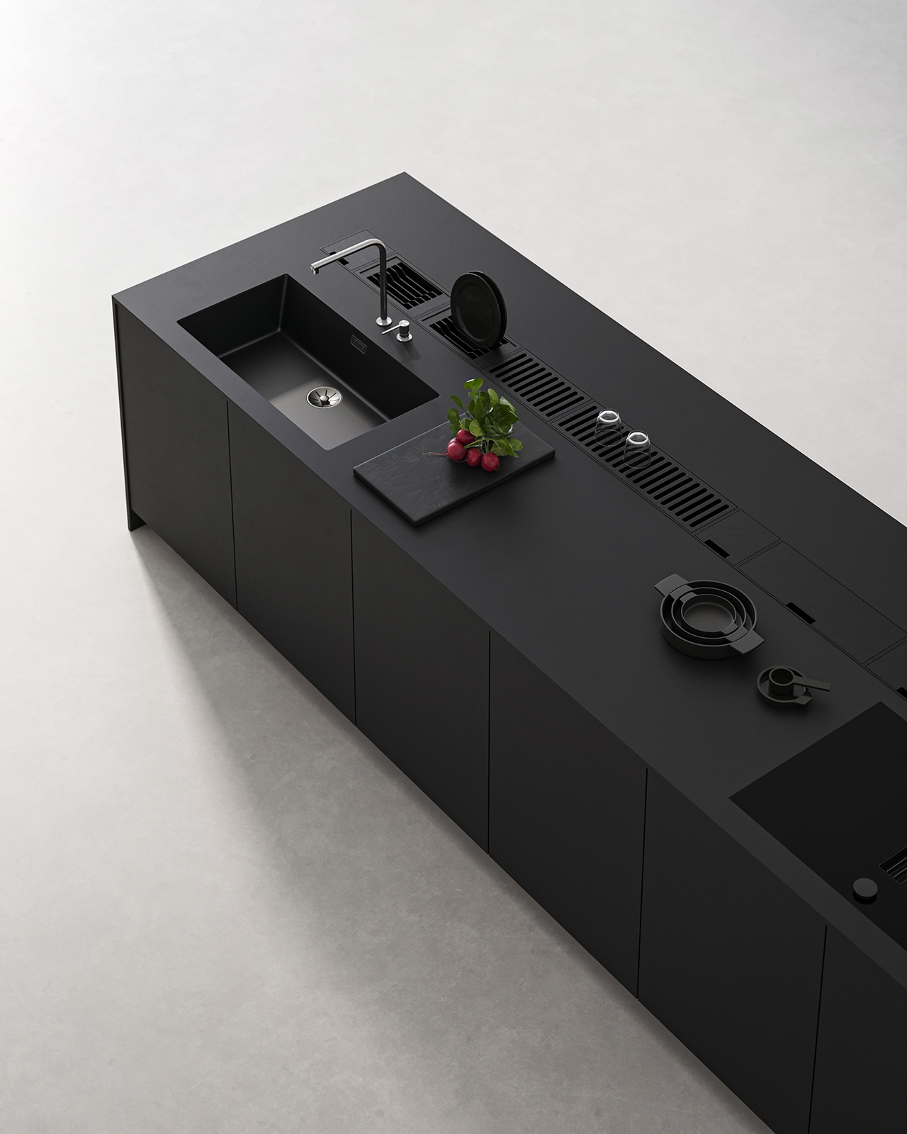
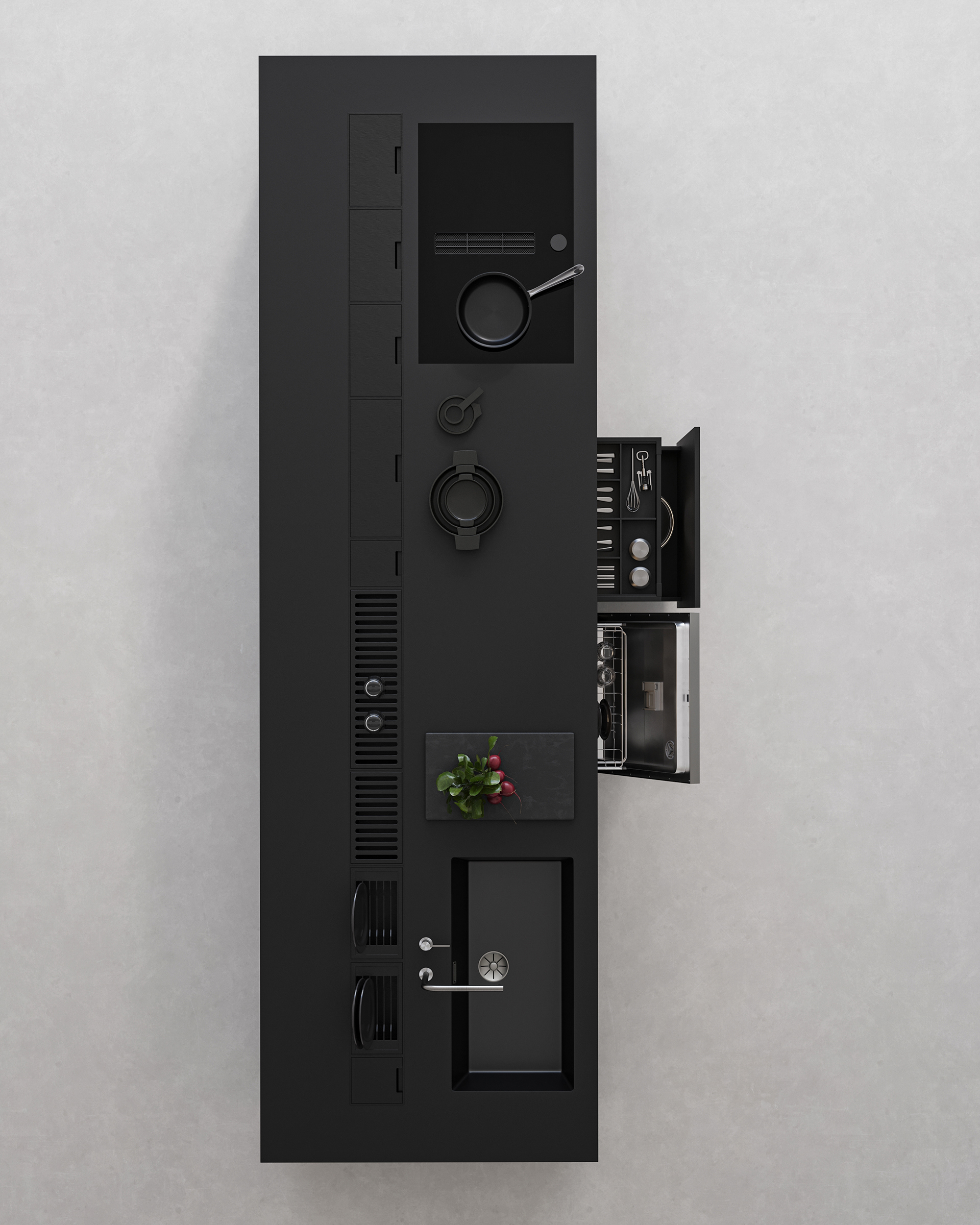
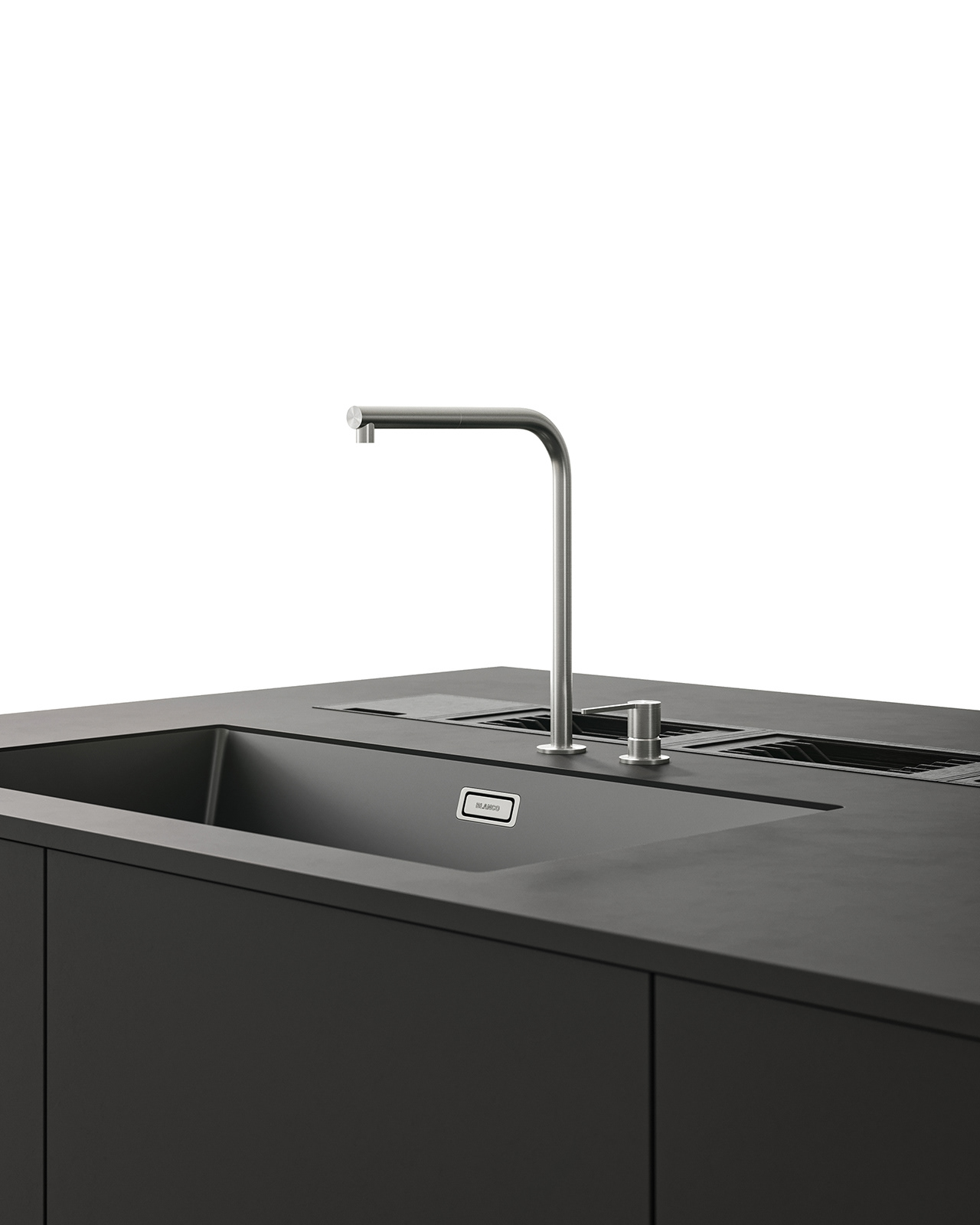
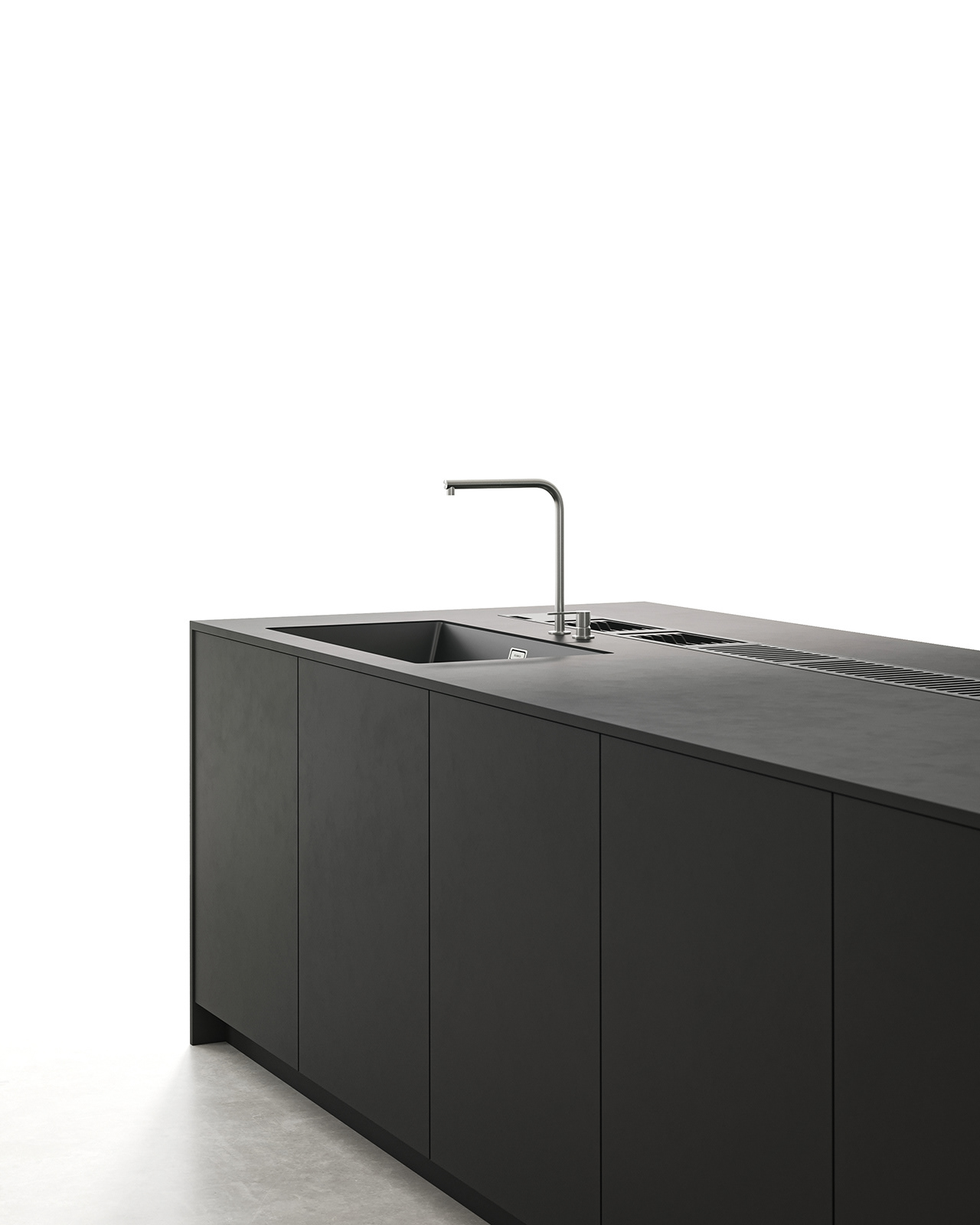
The black island was configured as an integrated system combining cooking, cleaning, and storage functions.
Visible elements on the countertop were minimized
to allow the product’s inherent form and function to be naturally expressed.
The overall structure and composition were kept simple and clear
to ensure that the product’s original color and material textures were accurately conveyed.
The red cabinetry was positioned as the visual focal point,
while the indirect lighting on the back panel and the systematic storage layout
helped create the image of a well-organized kitchen system.
The black island was configured as an integrated system combining cooking, cleaning, and storage functions.
Visible elements on the countertop were minimized
to allow the product’s inherent form and function to be naturally expressed.
이 프로젝트는 레드와 블랙의 대비를 중심으로 구성한 키친 카탈로그 비주얼입니다.
제품 고유의 색감과 소재의 질감이 정확하게 전달되도록 전체 구조와 구성을 단순하고 명확하게 기획했습니다.
레드 캐비닛은 시각적 중심이 되도록 설정했으며,
후면 패널의 간접 조명과 체계적인 수납 구조를 통해 정돈된 주방 시스템의 이미지를 구현했습니다.
블랙 아일랜드는 조리·세척·수납 기능을 통합한 일체형 시스템으로 구성했으며,
상판 위 노출 요소를 최소화해 제품 본연의 형태와 기능이 자연스럽게 드러나도록 했습니다.
제품 고유의 색감과 소재의 질감이 정확하게 전달되도록 전체 구조와 구성을 단순하고 명확하게 기획했습니다.
레드 캐비닛은 시각적 중심이 되도록 설정했으며,
후면 패널의 간접 조명과 체계적인 수납 구조를 통해 정돈된 주방 시스템의 이미지를 구현했습니다.
블랙 아일랜드는 조리·세척·수납 기능을 통합한 일체형 시스템으로 구성했으며,
상판 위 노출 요소를 최소화해 제품 본연의 형태와 기능이 자연스럽게 드러나도록 했습니다.
Design & Visualization by mitter studio